Shopping Funnel Optimization
Product Designer

Fall 2024
Just skimming?
Here's the 1-min recap.
The Why
In high-choice industries (like fashion/beauty, our main collaborated ones), our initial 3 suggestions frequently missed the mark, causing high user drop-off and decision fatigue before shoppers could find a compelling match.
The What
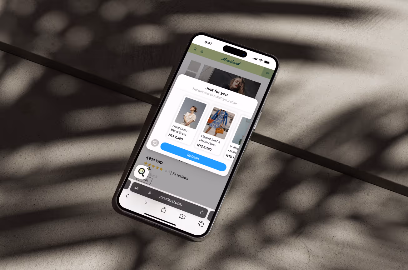
I designed and championed a subtle 'Refresh' button, empowering users to re-roll suggestions without restarting the flow. This small but critical interaction sustained engagement and increased the likelihood of a strong product match.
The Wow
Stakeholders immediately adopted, implemented, and shipped the solution across the platform. Based on early client case studies, the feature delivered an expected add-to-cart conversion increase of over 75% for incoming partners.
See the story beneath the surface ↓
Why customers need suggestions?
Decision fatigue is real
73% of shoppers walk away. This is not because your product’s bad, but because choice feels exhausting. When everything looks similar, and nothing stands out, people freeze. They want help making confident decisions without the mental overload.
Background
The Three-Option Dilemma
Our service narrowed choices down to just 3 items, a smart move for simplicity. But what if those 3 didn’t quite hit the mark? I saw a chance to make the experience more flexible and forgiving, so users wouldn’t feel stuck or let down by their first results.
Problem
Starting with Confusion. Ending with Uncertainty.
The journey began with little context and no clear reason why to engage. It ended with 3 suggestions that weren’t always a match. Without clear value upfront or a way to course-correct, users were left underwhelmed and unlikely to return.
Without research resources, I hypothesized:
• Users might not reuse the service after one mismatch.
• The effort-to-reward ratio didn’t feel worth it.
• A repetitive flow for similar results? Fatigue sets in.
Solution
01 A Clearer Introduction, from the First Second
People don’t stick around if they don’t get it. I designed a motion-led intro with clear, human-centered copy so users knew what the product did and why it mattered. This help to build trust fast, set expectations early, and invite people in.
02 One Tap, Better Results
Sometimes algorithms miss. And when shoppers only get 3 picks, that miss can be the end of the journey.
To approach this, I add a small-but-mighty refresh button. No need to restart, just re-recommend.
This gave users control, improved engagement, and opened the door for a second chance to connect with the right item.
Expected Outcome
We validated the feature with a 75.2% increase in conversion rate in our first client case study. Based on this success, we anticipate driving over 75% add-to-cart conversion lift for incoming partners by eliminating friction and maximizing the potential for product matches.
For Shoppers

Boosting the chance of matching their expectations meant:
• Personalized results that actually feel helpful.
• A smoother, lighter path to products they’ll love.
• Fewer dead ends. More delight.
For Business

Helping customers find what they want faster meant:
• Higher conversions and average order value
• Less confusion, more confident purchases
Reflection
Learnings
01 Designing Without Data Doesn’t Mean Designing Blind
I didn’t have access to formal research but that didn’t stop me. I drew from user behavior patterns, eCommerce norms, and competitive analogies: how AI tools always include a regenerate button, or how chatbots catch attention when users stall. Paired with product instinct, these clues helped me design with clarity in an early-stage environment.
02 Selling Ideas Without Numbers
I learned to sell ideas based on sound UX logic when hard data wasn't available. By clearly framing why the animation mattered and how the re-recommend button solved a documented friction point, I successfully earned stakeholder buy-in, even in an early-stage environment.
03 Small Buttons. Big Ripples.
Sometimes, one click is all it takes. This project reminded me that you don’t need a complete redesign to create value. Thoughtful, well-timed interactions can shift the whole user experience if they come from empathy.
READ MORE