infFITS Website Makeover
Product Designer & Copywriter

Fall 2024 - Spring 2025
Just skimming?
Here's the 1-min recap.
The Why
As new features launched, our existing site was incoherent, diminishing our value proposition and directly contributing to missed business opportunities.
The What
I spearheaded the complete website redesign, streamlining key UX flows, overhauling 90% of the copy, and elevating the visual style to deliver a more cohesive, engaging, and business-focused narrative.
The Wow
The revamped site achieved remarkable client resonance: we drove a 19% growth in conversions, alongside a massive 184% increase in YoY website traffic, a 114% boost in content engagement, and a significant 37% drop in bounce rate.
See the story beneath the surface ↓
Background
Our Vision Evolved—But the Design Stayed Behind
We had new services. New value. But a site still stuck in 2020.
Originally built for a single product, the site no longer reflected who we were or what we offered.
As the sole designer, I led the full redesign from structure and layout to copy and visual direction. Working closely with PMs and developers, I turned a scattered site into a clear story that sells.
Problem
When Everything Speaks, Nothing Stands Out
Our homepage had turned into a catch-all maze—too many messages, too little clarity. Here's what held it back:
1. Messaging felt inconsistent and hard to follow
2. Flat layout made every section compete for attention
3. No clear path leading users to the actual product
4. Visuals lacked purpose and failed to support the message
Approach
01 Copywriting that Paints a Vivid Picture
Our services are built for businesses—but success depends on the end customer’s experience.
I rewrote the copy to reflect that: friendly, confident, and focused on value and outcome.
These lines don’t just inform. They help people visualize what better really looks like.
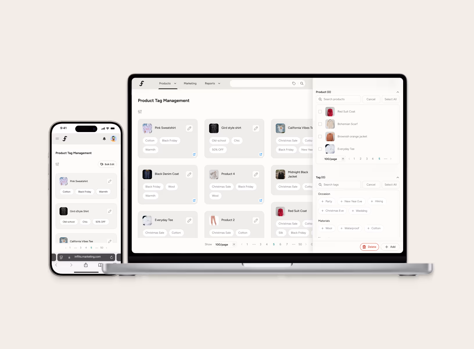
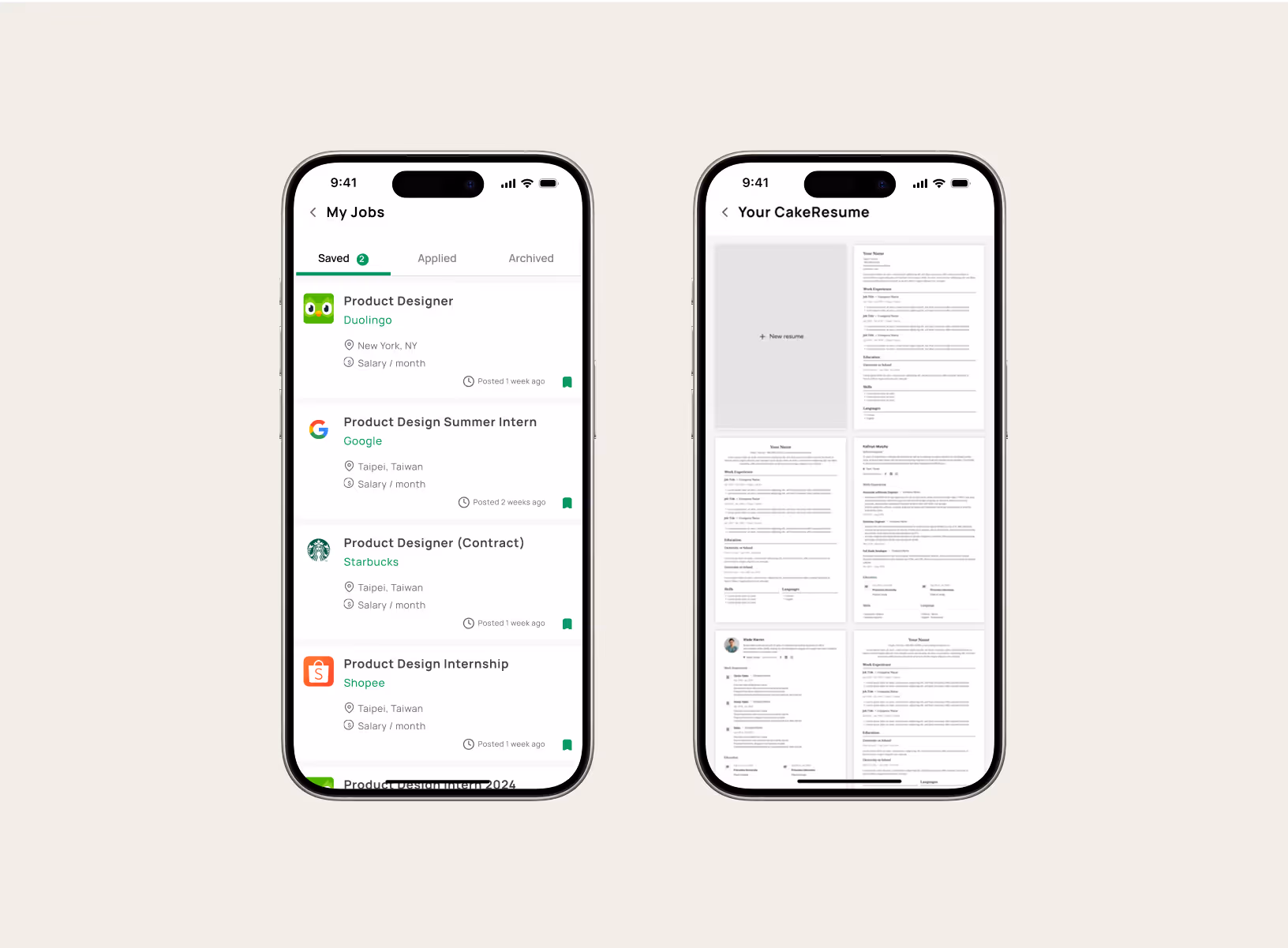
02 Visuals that Do the Talking
Take our AI Size suggestion service, for instance. We had strong tech—but weak presentation. The message wasn’t landing, and the visuals didn’t help.
I redesigned the section to emphasize benefits over buzzwords, using sharper visuals and clearer flow to create a story that actually sticks.
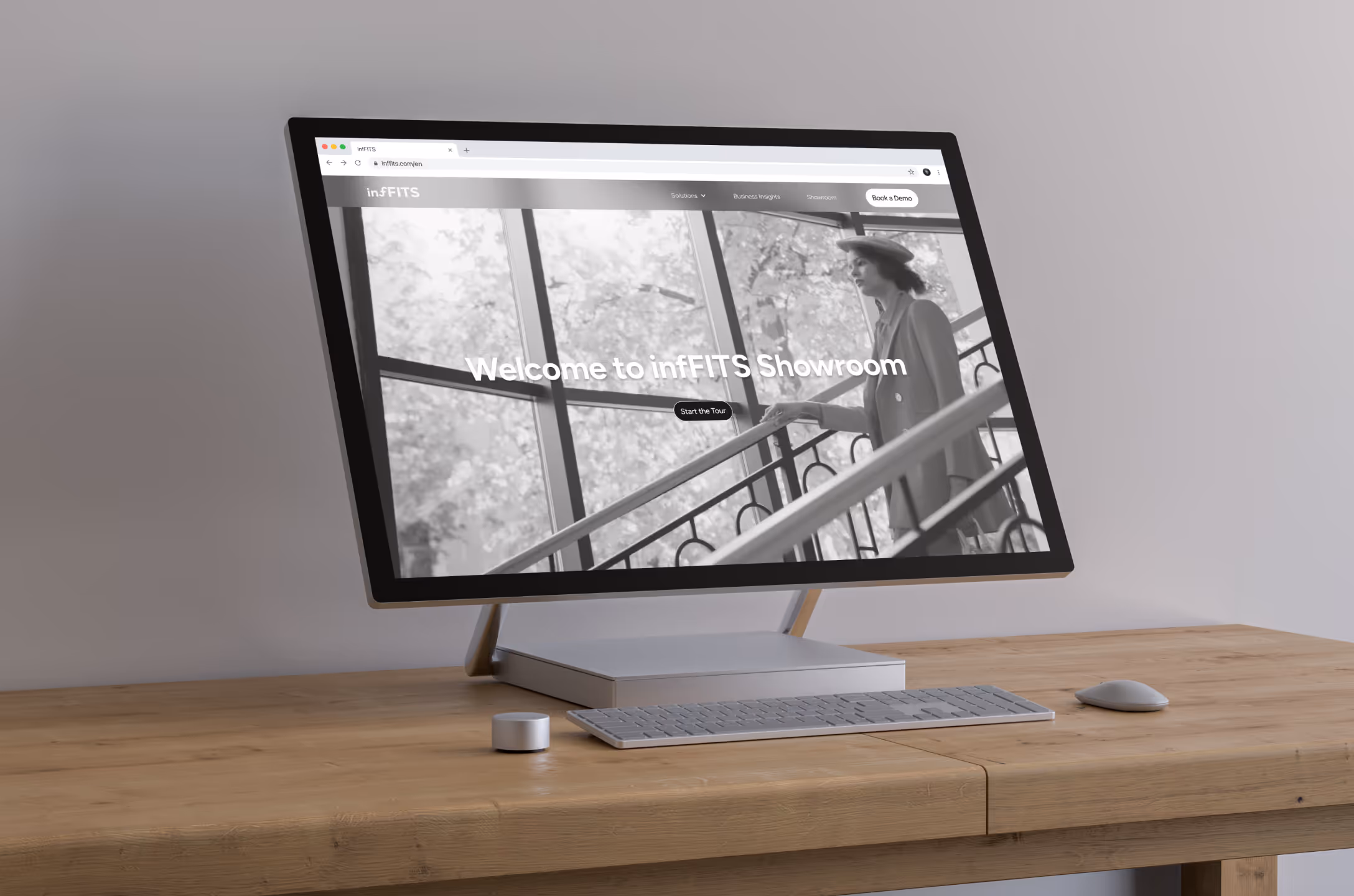
03 Motion as a Guided Experience
What’s the best way to explain a product? Let users experience it.
I proposed a new showroom page—an interactive journey that lets potential partners see the flow from a customer’s point of view. From discovery to decision, the motion-led design creates curiosity—and drives real engagement.
Result
Driving Engagement and High-Profile Interest
Post-launch, the site immediately began capturing the attention of industry-leading brands, including Under Armour, Lancôme, and Paula's Choice.
The improved clarity not only enhanced our value proposition but also resulted in a measurable increase in qualified leads.
Reflection
Learnings
01 Copy as a Conversion Tool
I learned that effective B2B copy must be more than just clear; it must be actively persuasive. I applied principles from leading tech companies, focusing on framing pain points and backing up our value proposition with impact data. This strategic combination built trust and became a primary driver of action in every headline and metric.
02 Building a Site from the Ground Up
Going from zero to launch taught me how many details shape a high-performing website. It’s not just layout and visuals—it’s SEO, load time, file size, animation, messaging, and flow. If I did it again, I’d think even more about when users are most likely to convert and how to design for those moments.
03 Letting Visuals Do the Talking
Not everyone reads so visuals need to speak clearly. I focused on making illustrations and layouts that convey value instantly, even without reading the copy. Clear structure, simple motion, and before-after storytelling became key to making the message stick.
READ MORE